THE BRIEF
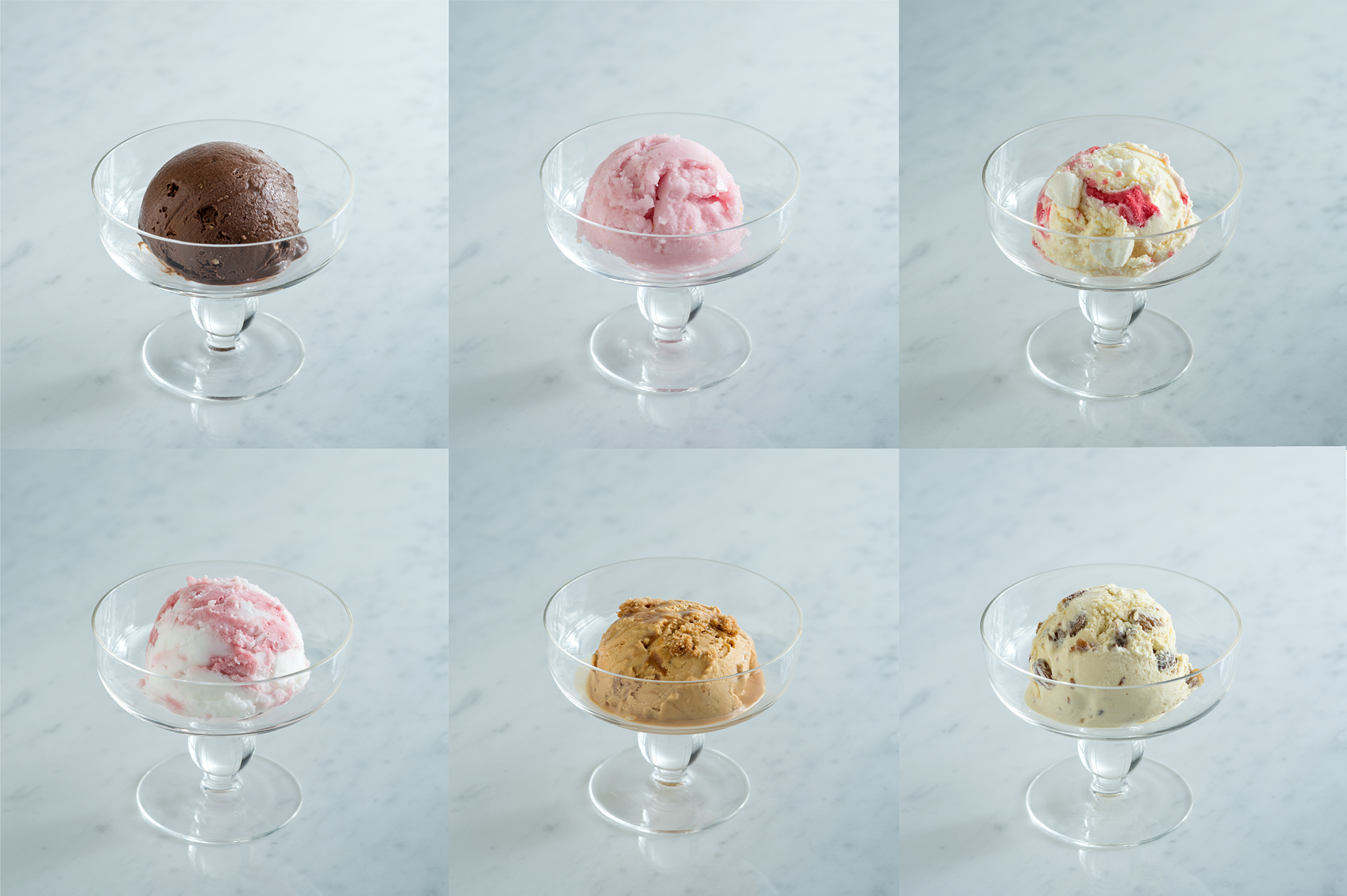
Create an elegant and stylish menu leaflet for a limited edition ice cream selection aimed at Japanese customers.
Create an elegant and stylish menu leaflet for a limited edition ice cream selection aimed at Japanese customers.
CREATIVE SOLUTION
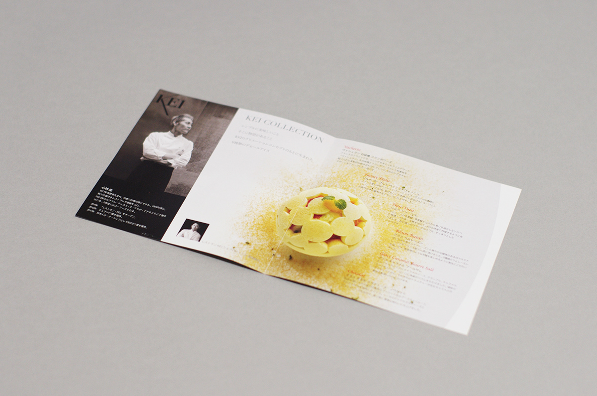
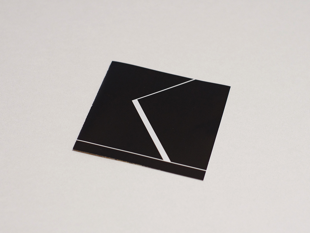
Keeping cover simple black colour which is in line with his branding, with the iconic K logo in front. On the inside a large image of the ice cream is used to accentuate the beauty of his work. Main image pops out by the use of monochrome photographs for the portrait shots.
Keeping cover simple black colour which is in line with his branding, with the iconic K logo in front. On the inside a large image of the ice cream is used to accentuate the beauty of his work. Main image pops out by the use of monochrome photographs for the portrait shots.